#31 - Rotgelb
☮ Sept. 2023 - Rotgelb
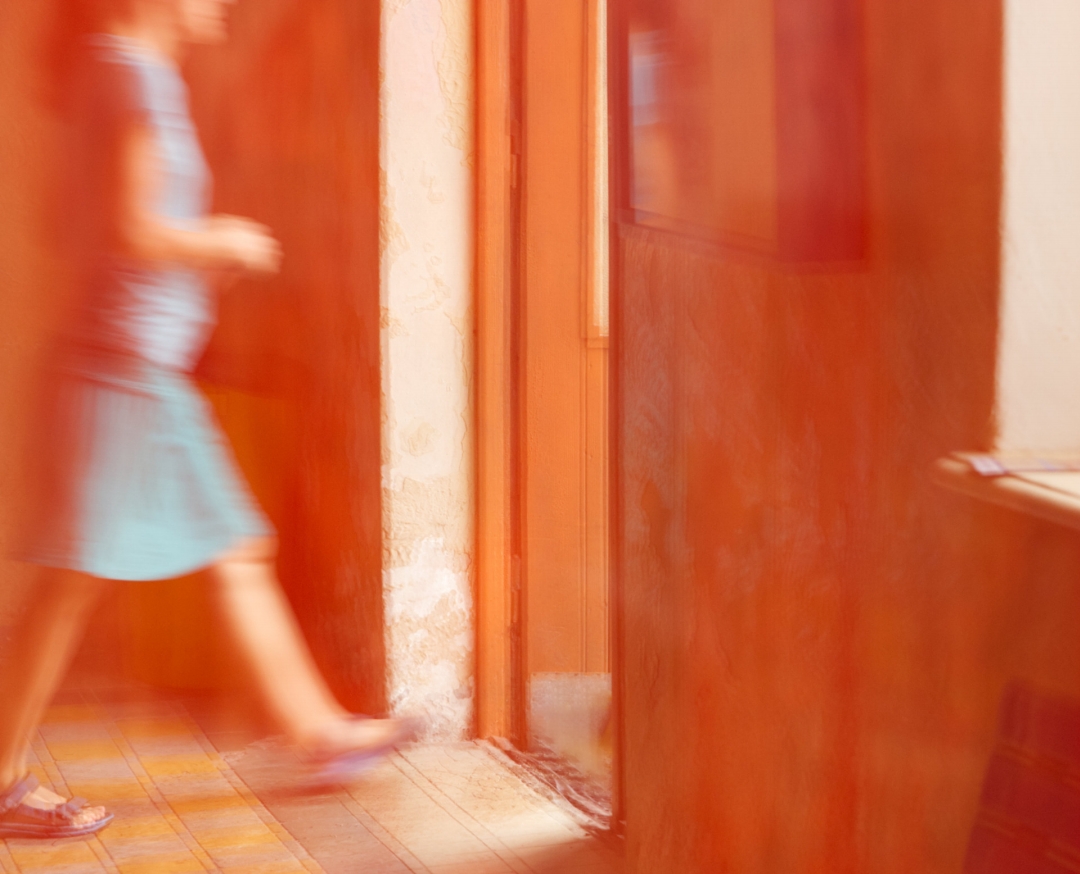
Zugegeben, ich weiß nicht, ob der Titel zu Bild und Text besonders gut gewählt ist. Aber es ist manchmal eben so. Dieses Bild hier von Konny, hat sofort ganz viele Gedanken ausgelöst, die man kaum in einem Titel erfassen kann.
Wie wollen wir uns dem Bild nähern? Da sind gleich mehrere Ebenen.
Vielleicht so:
Die Bildskizze:
Ein junger, weiblicher Mensch in sommerlich leichter Bekleidung, schreitet von links kommend nach rechts aus einem Raum in Richtung Tür. Die Tür ist eine nach außen offenstehende Außentür. Durch den weitgeöffneten Türflügel fällt sehr viel Licht auf die Dielen des Zimmerbodens. Zum rechten Bildrand orientiert, erkennen wir die durch den Bildrand angeschnittene Leibung und den Teil einer Fensterbank eines Fensters. Das gesamte Bild wird bis auf das blassblaue T-Shirt und den blauen Rock von rotgelben Orange-, Terrakottatönen bestimmt.
Auf der Technikseite haben wir eine völlig unscharfe Aufnahme. Technisch die Totalkatastrophe, oder? Sind wir doch, dank digitaler Aufnahmetechnik und tiefgreifender Bildbearbeitungen, gewohnt nur aller schärfste Bilder präsentiert zu bekommen.
Aber genau dies, die Unschärfe, ist hier auch ein ganz zentrales und das wesentliche Element der Bildgestaltung und insbesondere des Bildausdrucks.
Auf der farblichen Seite erleben wir eine Komposition aus Orangetönen oder Rotgelb. Die Wahrnehmung dieser Farbe fällt beim jeweiligen Betrachter unterschiedlich aus. Während bei Frauen und Niederländern die Farbe Orange als sehr positiv besetzt aufgenommen wird, ist diese Farbe bei Männern weniger beliebt. Psychologen zufolge wird Orange als stimulierend, stimmungsaufhellend empfunden. Variationen und Kombinationen mit Terrakotta-Tönung wirken zusätzlich belebend und optimistisch. Tiefenpsychologisch steht diese Farbgebung als Wunsch nach Einheit und für Kommunikation.
So unterstreicht die Farbgestaltung des Bildes, passend zum Motiv, die erfrischende Fröhlichkeit und jugendliche Bewegung.
Die Bewegungsrichtung des Menschen vor dem farbpsychologischen Hintergrund ergibt insgesamt einen sehr positiven Bildeindruck mit einer optimistischen Erwartungshaltung und der Zukunft zugewandten Sicht der handelnden Person.
Zielgerichtet und stramm erfolgt die Bewegung zur Tür ins Freie. Kein Zaudern und Zögern ist erkennbar. Hoffnungsvoll und belebt schreitet der junge Mensch in die Welt, in eine momentan noch unscharfe Zukunft außerhalb des Bildes.
Wir vergeben wieder mal📷 📷📷 📷📷📷 , 99 für die wunderbar optimistische Aufnahme eines alltäglichen Augenblicks.
Die Lyrik zum Schluß
Warum die Zitronen sauer wurden - von Heinz Erhardt
Ich muss das wirklich mal betonen:
Ganz früher waren die Zitronen
(ich weiß nur nicht genau mehr, wann dies
gewesen ist) so süß wie Kandis.
Bis sie einst sprachen: „Wir Zitronen,
wir wollen groß sein wie Melonen!
Auch finden wir das Gelb abscheulich,
wir wollen rot sein oder bläulich!“
Gott hörte oben die Beschwerden
und sagte: „Daraus kann nichts werden!
Ihr müsst so bleiben! Ich bedauer!“
Da wurden die Zitronen sauer . . .
TRANSLATION
☮ Sept. 2023 - Red-yellow
Admittedly, I don't know if the title to the picture and text is particularly well chosen. But sometimes it is like that. This picture here by Konny immediately triggered a lot of thoughts.
[picture] Into the light
How do we approach the picture? There are several levels.
Maybe like this:
The sketch:
A young, female person, dressed in summery light clothing with a skirt, strides from the left of the picture to the right out of a room towards the door. The door is an exterior door open to the outside, because a lot of light falls through the wide-open door leaf onto the floorboards of the room. Facing the right edge of the picture, we can see the soffit cut by the edge of the picture and the part of a sill of a window.
On the technical side we have a completely blurred shot. Technically a total disaster, isn't it? After all, thanks to digital recording technology and extensive image processing, we are used to being presented with only the sharpest images.
But exactly this, the blurriness, is also a very important element of the image design and especially of the image expression.
On the colour side, we experience a composition of orange tones. The perception of this colour varies. While women and Dutch people perceive the colour orange as having a positive connotation, this colour is less popular with men. According to psychologists, orange is perceived as stimulating, mood-lifting. Variations and combinations with terracotta tint have an additional invigorating and optimistic effect. Deep-psychologically, this colour scheme stands for a desire for unity and for communication.
Thus, the colour scheme of the painting, matching the motif, underlines the refreshing cheerfulness and youthful movement.
The direction of the person's movement in front of the colour-psychological background results in a very positive picture impression overall with an optimistic expectation of the person acting. The movement towards the door into the open air is purposeful and tight. No hesitation or hesitating is discernible. Hopeful and animated, the young person strides into the world, into a currently still blurred future outside the picture.
Once again we award📷 📷📷📷📷 , 99 for the wonderfully optimistic shot of an everyday moment.